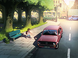
I'm back with some news on the progress of the Wormworld Saga Online Graphic Novel. I have moved past the 40% mark and therefore have reached the second of my five milestones for the first chapter. And like I promised I have some first real panel artwork for you to see! This artwork has yet to be composed and color corrected and I'm constantly fixing details in all panels but it gives a good first impression of the look of the graphic novel I think.
As you can see, the first chapter contains a lot of unusual subjects for me. I'm not really used to painting scenes from the real world. I like to paint nature and fantasy scenes. All the straight lines and angles in the architecture and the cars were really hard work for me and it also wasn't easy to find the right style for these elements. I didn't want to become too clean in the rendering but on the other hand I also didn't want the hard and shiny surfaces of the cars for example to look too sloppy. I hopefully have found a balance here that will fit to the fantastic subjects that will emerge later in the story.
Fortunately, by reaching the 40% mark I've also come to the point where the action leaves the city now and moves towards new subjects.
The fact that I had to paint a lot of stuff that I normally don't paint also had an impact on the time I needed for the second milestone. I painted a total of 45 hours on 18 panels so I'm way over my estimated 26 hours from after the first milestone (which had only 9 larger panels). My current estimation is, that I'm going to need a full month for every milestone from now on, Hopefully I'm able to finish the third milestone in June and the forth milestone in July. In August I'm leaving for a three weeks holiday in Spain where I'm not going to work on the graphic novel (except maybe for some script writing and sketching) so that the last milestone will have to wait until September. If everything works out like expected I'm going to design the Wormworld Saga website in October and might be ready for launch at the beginning of November - exactly one year after the announcement of the project on daniellieske.com. Well, that would be nice.
I'll keep you updated!
Sunday, June 6, 2010
Subscribe to:
Post Comments (Atom)


I really like the city scape panel, with the big buildings and the cars. Reality but still has some Daniel Lieske fantasy in it. : ]
ReplyDeleteI can't wait to see more of it, I became so interested in this graphic novel. : ]
Yay! :D
ReplyDeleteI really like what I see.
Little nitpick: In the second image, where the boy is approaching the car, the car could be a little bit more "sloppy" to use your words. It's a tiny bit too clean and the values are a bit too real to really fit in. Also the proportions from that angle seem a lot more like the real world object compared to the next picture. Just an opinion of course and I'm really looking forward to be able to read the first chapter.
@$#^%@#$%@%$!!!!!! I CAN'T WAIT! I'm always so excited every time I see an RSS update from your site in my inbox.
ReplyDeleteWow, looks great, can't wait to see more! :)
ReplyDeleteAnd 18 panels in 45h?! I think that's really fast for a style like this. I'm happy to draw a page a day- you almost paint one fully.
impressive use of lights
ReplyDeleteThis is an incredibly beautiful and epic work of art. I cannot wait to see where this goes and actually read your novel! Epic stuff!!!!
ReplyDeleteIch find's verdammt schön zu sehen, dass du dich an das realistische Setting versucht hast und tolle Ergebnisse liefern kannst, obwohl es nicht dein Ding ist.
ReplyDeleteKleine konstruktive Kritik am Rande:
Ich würde es nicht mit der Überbeleuchtung übertreiben.
Bei dem dritten Bild passt es perfekt.
Es herrscht eine schöne Atmosphäre
Beim letzten Bild finde ich es allerdings unpassend, zum einen weil man dann gezwungen ist auf die Straße zu schauen, die recht glatt und statisch wirkt, zum anderen weil man im Vergleich zu den anderen Bildern die Chance hat den Himmel zu sehen. Und ich weiß, dass du prachtvolle Himmelsszenerien malen kannst.
Aber das weißt du sicher auch selbst und konntest es aus Zeitgründen vielleicht(?) nicht anders lösen.
Ich find das Projekt bisher aber erste Sahne. Weiter so!
Ich möchte auch mal mein Gefallen äußern! =) Finde die Bilder bislang sehr vielversprechend und wunderhübsch. N prachtvoller Himmel ist bei noch tiefstehender Sonne und fast Gegenlicht ja auch nicht unbedingt nötig. Und das Licht-/Schattenspiel gefällt mir auch. Immerhin gibt's da eben auch oft Sonne und schattenwerfende Objekte. Daher isses für mich noch nicht überbeleuchtet. Aber mit der Straße stimme ich meiner Vorrednerin zu: Die klaut ein büssl den Zauber. So sauber, glatt, statisch.
ReplyDeleteViel Freude und Erfolg! =)